Branding for a global market
ASPEN MEDICAL
Aspen Medical is a provider of global healthcare solutions who engaged CRE8IVE to undertake a brand and visual identity refinement, as their existing branding and collateral didn't represent the integrity, ingenuity or the scope of the work they were involved in.
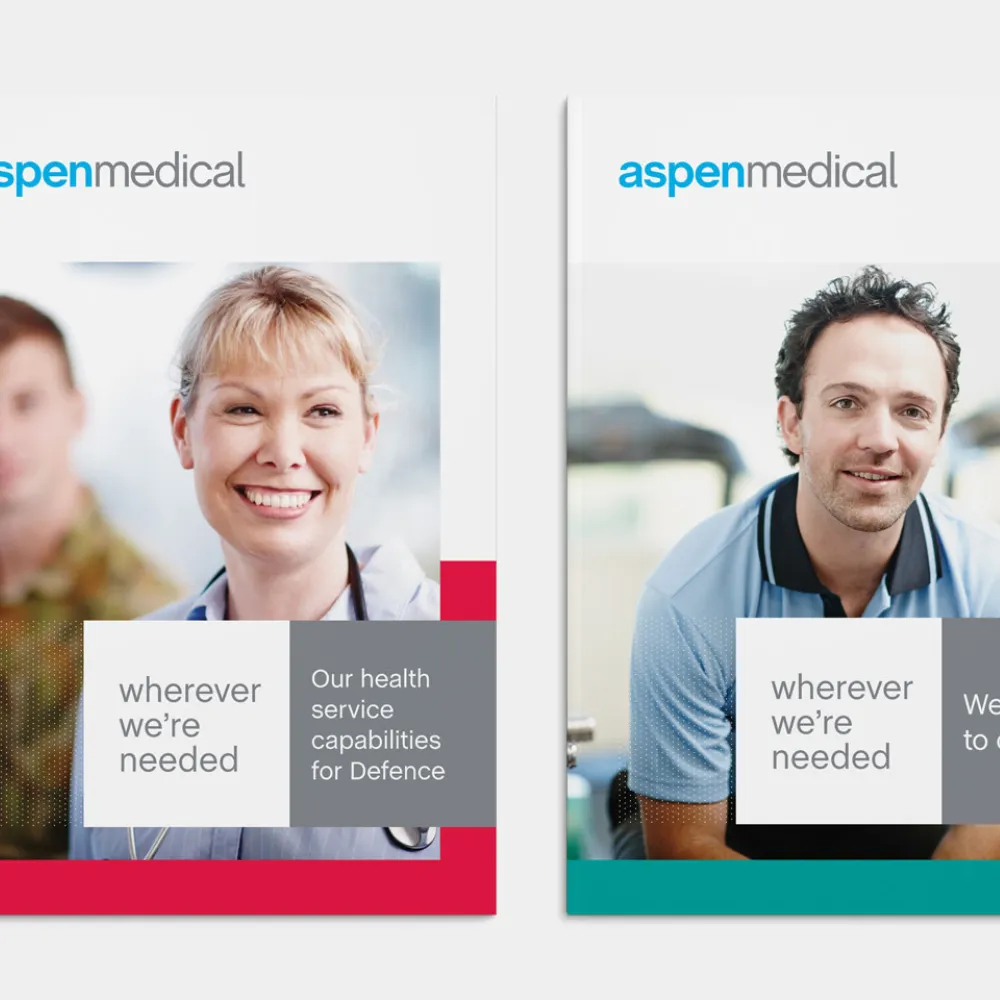
As a rapidly expanding business with a global presence, Aspen Medical not only required a cohesive brand, but one that would translate across multiple markets and continents. Existing elements of the Aspen brand were retained but updated to reflect a more modern organisation. They were also designed to tie-in with the company tagline "Wherever we're needed".
An extensive photoshoot featuring "real-life" Aspen employees was undertaken as a part of the rebrand, which helped form the basis of the bold new visual identity.
The new brand has been rolled out across the business' corporate stationery, website and social media channels, along with corporate collateral including brochures, forms, and internal templates to ensure all brand touch points incorporated the refreshed look.
Brandmark
Key to the Aspen brand refinement was simplifying the type mark and ensuring a bold and confident persona was portrayed.
Photoshoot
The single subject images reinforce Aspen Medical's core business of providing healthcare solutions in diverse and often challenging environments worldwide.

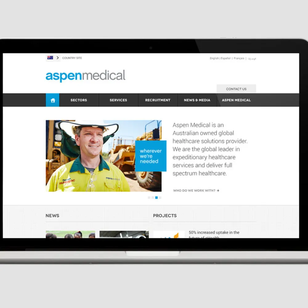
Digital
The new Aspen medical website aimed to use the depth of industry case studies and diverse expertise as the focus of what this organisation could deliver for a potential client.
Style guide
A comprehensive style guide was developed to help guide the direction and consistency of the Aspen brand around the globe.
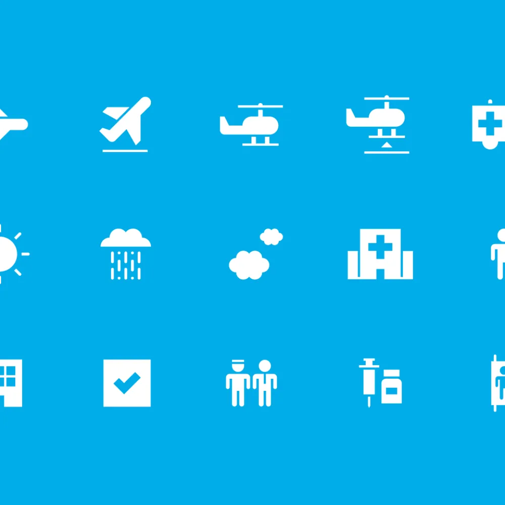
Iconography and Illustration
A suite of icons were developed for use within infographics and diagrams to aid in explaining processes and procedures within tender documents.